The Interior Blog
How to Incorporate Indoor Plants into a Colour Scheme
Do your houseplants feel like an afterthought in your decor — mismatched pots, clashing greens, or awkward visual breaks? Incorporating indoor plants into a colour scheme isn’t just about matching leaves to walls. It’s a design strategy that enhances flow, adds depth, and supports a harmonious visual experience.
Professional designers treat greenery as part of the palette. With the right choices in foliage tone, pot materials, and placement, your plants can become seamless, stylish elements in any space.
Understanding the Core: The Colour Psychology of Greenery
Indoor plants don’t exist in isolation — their colour, texture, and form interact with your room’s palette. From soft sage tones to deep emeralds, each plant introduces a unique shade that can either support or disrupt your interior theme.
Understanding plant and colour matching means assessing:
- Foliage tones — bright, dark, variegated, or bluish-greens
- Pot finishes — ceramic, matte, metal, wood, glass
- Backdrop influence — wall paint, textiles, natural light
Designers often work from a colour wheel to create harmonious combinations. Green, being a cool and balanced hue, pairs well with neutrals, earth tones, warm blushes, and even bold accents like gold or teal. The goal is to build cohesive interiors where plants feel intentionally styled, not randomly placed.
Checklist at a Glance: Plant + Colour Pairing Tips
- Assess the dominant palette of the room
- Match plant shades to colour temperature (warm vs cool)
- Use pots to echo the wall or accent tones
- Repeat colours across the plant, pot, and other decor items
- Use contrast sparingly to create visual focus
- Layer textures to avoid a flat look
- Stick to 2–3 key materials in planters for cohesion
- Let foliage tone guide accent choices
Step-by-Step Guide: Creating a Harmonised Plant Decor Look
1. Start by identifying your base colour scheme
Look around your room. What are the dominant colours in your furniture, walls, flooring, and fabrics? Are they warm (beige, tan, terracotta) or cool (grey, navy, lavender)?
Understanding this helps determine which plants — and containers — will work with or against the palette.
Pro Tip: Take photos of your room in natural light and use a free colour palette generator to extract your core tones.
2. Choose plant varieties that support your scheme
- Warm rooms pair well with deep green or red-tinged foliage like rubber plants or red aglaonema
- Cool-toned spaces benefit from bluish or silvery leaves — try eucalyptus, snake plant, or pilea
- Neutral palettes (white, cream, wood) are versatile — both variegated and solid greens work well
Important Note: Some plants change shade depending on light — test them near your walls before committing.
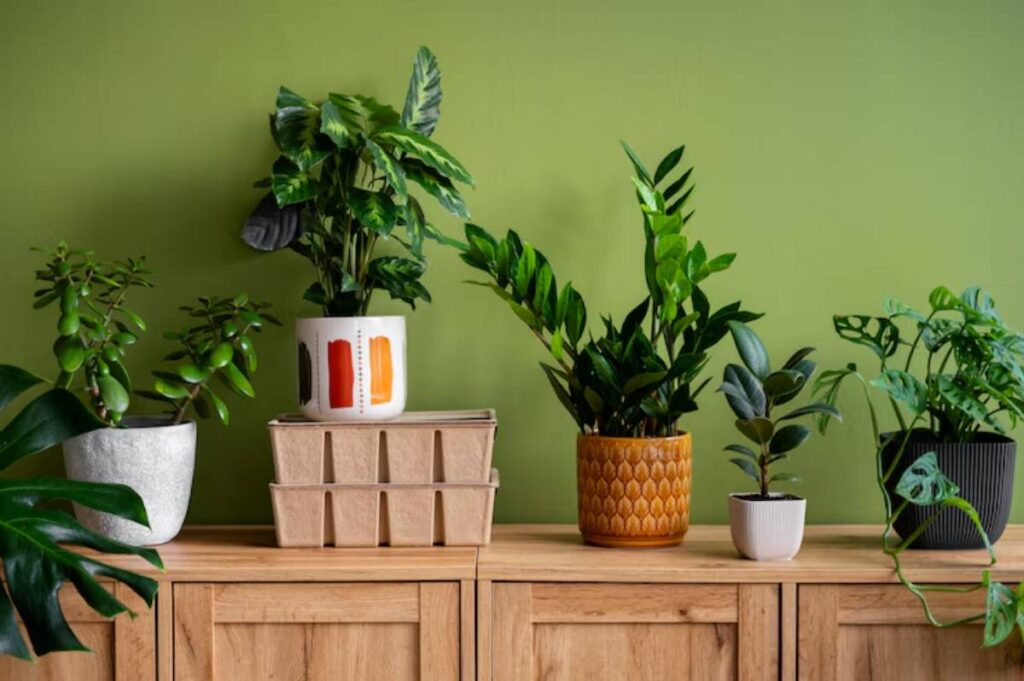
3. Echo colours in your planter selections
Instead of treating pots as afterthoughts, use them to reinforce or balance your palette:
- Match pots to accent colours in cushions or art
- Use neutral tones (white, grey, beige) to let foliage stand out
- Try matte finishes for minimal schemes, or glazed textures for rich, layered looks
For ideas on balancing function and beauty, see how others are choosing the right pot size and shape for decor impact — a great way to unify colour with form.
4. Apply the 60–30–10 rule
Interior designers often use this rule to build balanced spaces:
- 60% dominant colour (walls/furniture)
- 30% secondary (rugs/textiles/plants)
- 10% accent (planters, trim, art)
Let plants fall into your secondary or accent tier. A burgundy-toned calathea or matte-black ceramic pot can tie the room together more subtly than loud prints or patterns.
5. Layer texture, not just colour
Visual harmony isn’t just about hue — it’s also about finish and shape.
Combine:
- Matte leaves with glossy planters
- Spiky foliage with soft textiles
- Terracotta pots with linen curtains
Pro Tip: Use colour families — sage, olive, mint — rather than trying to match exact shades. This creates harmony without feeling forced.
Best Practices & Additional Insights
- Real-world tip: In a soft grey living room, pairing a dark green monstera with a brushed brass pot brings warmth and depth without disrupting tone.
- Style metaphor: Think of your plants like throw pillows — they add softness and interest, but only work when in conversation with the whole space.
- Designer insight: Professionals often use greenery to balance “cold” or clinical rooms. In high-gloss modern spaces, trailing or broad-leafed plants add a human, organic counterpoint.
- Common misstep: Choosing plants without thinking about foliage tone. A neon pothos might feel too vibrant in a muted space unless anchored with darker elements.
If you’re layering plant displays, get inspired by the approach behind how to style floating shelves with indoor plants to create structure, symmetry, and subtle pops of coordinated colour.
FAQs
1. Can I colour-coordinate without repainting my room?
Yes! Use planter colours, plant foliage, and decor items (cushions, throws, art) to adjust tone and contrast.
2. Which plants have foliage that matches warm interiors?
Rubber plant, red aglaonema, croton, and calathea medallion are great choices.
3. What are the best planters for neutral or minimalist rooms?
Try raw ceramic, cement, terracotta, or matte-finish whites and greys.
4. Do all my pots need to match?
Not exactly. Stick to a consistent tone or material — such as all earthy tones or all metals — for visual unity.
5. How do I avoid visual clutter with plants?
Use negative space. Don’t overcrowd surfaces, and limit your colour materials to 2–3 per zone.
Conclusion
Styling your indoor plants to match your colour scheme is more than a visual upgrade — it’s a step toward a cohesive, intentional home. When greenery blends with your decor, it adds life and polish without pulling focus or feeling out of place.
With just a few thoughtful adjustments — matching foliage tones, curating planters, and respecting your palette’s mood — you can make your home feel harmonious, alive, and truly styled.
Try swapping one planter this week to reflect your interior palette — and see how the whole room transforms with that small shift.


YOU MAY LIKE